Moin, na das sieht doch sehr gut aus, aber es fehlt „sozusagen“ noch eine Verschachtelung zu deinem Beispiel oben. Ich versuche das nachher mal in einem Beispiel umzusetzen.
2 „Gefällt mir“
es war schon spät, oder vielmehr früh 
ja ich habe auch noch nichts eingestellt. größe der kachel muss auch noch angepasst werden.

ne navigationsleiste ist auch schon fast fertig….

ich teste immer gern erstmal einzelkomponenten und styles, bevor ich an das große ganze gehe.
würdest du deinen yaml-code teilen?
Personen-Karte

type: custom:vertical-stack-in-card
card_mod:
  style: |
    ha-card {
      background: linear-gradient(135deg, #3e3e3e, #a9a9a9);
      border-radius: 10px;
      box-shadow: 0px 0px 10px rgba(0, 0, 0, 0.1);
      padding: 16px;
      --ha-card-background: linear-gradient(135deg, grey, rgba(169,169,169,1));
    }
cards:
  - type: custom:button-card
    aspect_ratio: 3/1
    show_name: false
    styles:
      grid:
        - grid-template-areas: |
            "person_1 person_2 person_3 person_4"
        - grid-template-columns: repeat(4, 1fr)
        - grid-template-rows: auto auto
    custom_fields:
      person_1: |
        [[[
          let state = states["person.mrthiemann"].state;
          let borderColor = state === "home" ? "#77c66e" :
                            state === "not_home" ? "#EF4F1A" :
                            state === "Work" ? "deepskyblue" : "gray";
          return `<img src="${states["person.mrthiemann"].attributes.entity_picture}"
          style="width: 80%; border: 5px solid ${borderColor}; border-radius: 50%;">`;
        ]]]
      person_2: |
        [[[
          let state = states["person.nathalie"].state;
          let borderColor = state === "home" ? "#77c66e" :
                            state === "not_home" ? "#EF4F1A" :
                            state === "Work" ? "deepskyblue" : "gray";
          return `<img src="${states["person.nathalie"].attributes.entity_picture}"
          style="width: 80%; border: 5px solid ${borderColor}; border-radius: 50%;">`;
        ]]]
      person_3: |
        [[[
          let state = states["person.fynn"].state;
          let borderColor = state === "home" ? "#77c66e" :
                            state === "not_home" ? "#EF4F1A" :
                            state === "Work" ? "deepskyblue" : "gray";
          return `<img src="${states["person.fynn"].attributes.entity_picture}"
          style="width: 80%; border: 5px solid ${borderColor}; border-radius: 50%;">`;
        ]]]
      person_4: |
        [[[
          let state = states["person.justin"].state;
          let borderColor = state === "home" ? "#77c66e" :
                            state === "not_home" ? "#EF4F1A" :
                            state === "Work" ? "deepskyblue" : "gray";
          return `<img src="${states["person.justin"].attributes.entity_picture}"
          style="width: 80%; border: 5px solid ${borderColor}; border-radius: 50%;">`;
        ]]]
1 „Gefällt mir“
Climate-Karte

type: custom:vertical-stack-in-card
cards:
  - type: vertical-stack
    cards:
      - type: custom:better-thermostat-ui-card
        entity: climate.fritz_smart_thermo_301_1
        name: Thermostat
        show_current_temperature: true
        show_humidity: true
        card_mod:
          style: >
            ha-card {

            --ha-card-background: linear-gradient(135deg, grey,
            rgba(169,169,169,1));
              --primary-color:
                {% set temp = states['climate.fritz_smart_thermo_301_1'].attributes.current_temperature | float %}
                {% if temp <= 20 %}
                  #4287f5; /* Azul */
                {% elif temp > 20 and temp <= 23 %}
                  #f5a142; /* Laranja */
                {% else %}
                  #f54242; /* Vermelho */
                {% endif %};
            }

            .ha-control-circular-slider {
              --primary-color:
                {% set temp = states['climate.fritz_smart_thermo_301_1'].attributes.current_temperature | float %}
                {% if temp <= 20 %}
                  #4287f5; /* Azul */
                {% elif temp > 20 and temp <= 23 %}
                  #f5a142; /* Laranja */
                {% else %}
                  #f54242; /* Vermelho */
                {% endif %};
            }

            .slider-value {
              color:
                {% set temp = states['climate.fritz_smart_thermo_301_1'].attributes.current_temperature | float %}
                {% if temp <= 20 %}
                  #4287f5; /* Azul */
                {% elif temp > 20 and temp <= 23 %}
                  #f5a142; /* Laranja */
                {% else %}
                  #f54242; /* Vermelho */
                {% endif %};
            }
      - type: horizontal-stack
        cards:
          - type: custom:button-card
            color_type: blank-card
          - type: custom:button-card
            color_type: card
            color: rgb(112, 112, 112)
            icon: mdi:volume-plus
          - type: custom:button-card
            color_type: card
            color: rgb(112, 112, 112)
            icon: mdi:play
          - type: custom:button-card
            color_type: card
            color: rgb(112, 112, 112)
            icon: mdi:stop
          - type: custom:button-card
            color_type: card
            color: rgb(112, 112, 112)
            icon: mdi:volume-minus
          - type: custom:button-card
            color_type: blank-card
card_mod:
  style: |
    ha-card {
      background: linear-gradient(135deg, #3e3e3e, #a9a9a9);
      border-radius: 10px;
      box-shadow: 0px 0px 10px rgba(0, 0, 0, 0.1);
      padding: 16px;
    }
1 „Gefällt mir“
Wetter-Karte

type: custom:vertical-stack-in-card
card_mod:
  style: |
    ha-card {
      background: linear-gradient(135deg, #3e3e3e, #a9a9a9);
      border-radius: 10px;
      box-shadow: 0px 0px 10px rgba(0, 0, 0, 0.1);
      padding: 16px;
    }
cards:
  - type: weather-forecast
    entity: weather.forecast_home_2
    forecast_type: daily
    card_mod:
      style: |
        ha-card {
          --ha-card-background: linear-gradient(135deg, rgba(128,128,128,0.8), rgba(169,169,169,0.6))
Fenster-Türen-Karte

type: custom:vertical-stack-in-card
card_mod:
  style: |
    ha-card {
      background: linear-gradient(135deg, #3e3e3e, #a9a9a9);
      border-radius: 10px;
      box-shadow: 0px 0px 10px rgba(0, 0, 0, 0.1);
      padding: 16px;
    }
cards:
  - type: horizontal-stack
    cards:
      - type: custom:button-card
        entity: switch.tp_link_01
        icon: mdi:door
        show_icon: true
        aspect_ratio: 1/1
        hold_action:
          action: more-info
        tap_action:
          action: toggle
        name: Front Door
        show_state: false
        styles:
          card:
            - background: >-
                linear-gradient(135deg, rgba(128,128,128,0.8),
                rgba(169,169,169,0.6))
            - border-radius: 10%
            - padding: 12%
            - color: ivory
            - text-shadow: 0px 0px 5px black
            - text-transform: capitalize
            - box-shadow: rgb(38, 57, 77) 0px 20px 30px -10px
          grid:
            - grid-template-areas: "\"i bright .\" \"i bm .\" \"n cl .\" \"s cl .\""
            - grid-template-columns: 1fr min-content
            - grid-template-rows: 1fr min-content min-content
          name:
            - font-weight: 300
            - font-size: 20px
            - opacity: 1
            - color: white
            - align-self: middle
            - justify-self: start
          state:
            - font-weight: bold
            - opacity: 1
            - font-size: 9px
            - color: white
            - align-self: middle
            - justify-self: start
          img_cell:
            - justify-content: start
            - align-items: start
            - margin: none
          icon:
            - width: 60%
            - opacity: 1.2
            - color: "#4d576d"
          custom_fields:
            bright:
              - align-self: start
              - align-self: start
              - border-radius: 20px
              - font-size: 10px
              - font-weight: 300
              - width: 25px
              - display: |
                  [[[
                    return entity.state == 'off' ? 'none' : 'block'
                  ]]]
            cl:
              - align-self: start
              - justify-self: end
              - justify-self: end
              - display: |
                  [[[
                    return entity.state == 'off' ? 'none' : 'block'
                  ]]]
        state:
          - value: "on"
            id: value_on
            styles:
              card:
                - box-shadow: 0px 0px 10px 1px var(--button-card-light-color)
              name:
                - opacity: 1
              state:
                - opacity: 1
              img_cell: null
              icon:
                - opacity: 1
                - align-self: start
                - color: |
                    [[[
                      var [domain, object_id] = entity.entity_id.split('.');
                      if (domain === "light")
                        return 'var(--button-card-light-color)';
                      return '{{ color }}';
                    ]]]
              custom_fields:
                bright:
                  - align-self: start
                  - align-self: start
                  - border-radius: 20px
                  - font-size: 10px
                  - font-weight: 300
                  - width: 25px
                cl:
                  - align-self: start
                  - justify-self: end
                bm: null
          - value: "off"
            id: value_off
            styles:
              card:
                - box-shadow: none
              name: null
              state: null
              img_cell: null
              icon: null
              custom_fields:
                bright:
                  - align-self: start
                  - align-self: start
                  - border-radius: 20px
                  - font-size: 10px
                  - font-weight: 300
                  - width: 25px
                cl:
                  - align-self: start
                  - justify-self: end
                card:
                  - background-color: "#242e42"
                  - height: 25px
                  - width: 25px
                  - margin: 0px -5px
                icon:
                  - width: 15px
          - value: unavailable
            styles:
              state:
                - color: red
              icon:
                - color: red
            show_name: false
      - type: custom:button-card
        entity: switch.tp_link_01
        icon: mdi:door
        show_icon: true
        aspect_ratio: 1/1
        hold_action:
          action: more-info
        tap_action:
          action: toggle
        name: Back Door
        show_state: false
        styles:
          card:
            - background: >-
                linear-gradient(135deg, rgba(128,128,128,0.8),
                rgba(169,169,169,0.6))
            - border-radius: 10%
            - padding: 12%
            - color: ivory
            - text-shadow: 0px 0px 5px black
            - text-transform: capitalize
            - box-shadow: rgb(38, 57, 77) 0px 20px 30px -10px
          grid:
            - grid-template-areas: "\"i bright .\" \"i bm .\" \"n cl .\" \"s cl .\""
            - grid-template-columns: 1fr min-content
            - grid-template-rows: 1fr min-content min-content
          name:
            - font-weight: 300
            - font-size: 20px
            - opacity: 1
            - color: white
            - align-self: middle
            - justify-self: start
          state:
            - font-weight: bold
            - opacity: 1
            - font-size: 9px
            - color: white
            - align-self: middle
            - justify-self: start
          img_cell:
            - justify-content: start
            - align-items: start
            - margin: none
          icon:
            - width: 60%
            - opacity: 1.2
            - color: "#4d576d"
          custom_fields:
            bright:
              - align-self: start
              - align-self: start
              - border-radius: 20px
              - font-size: 10px
              - font-weight: 300
              - width: 25px
              - display: |
                  [[[
                    return entity.state == 'off' ? 'none' : 'block'
                  ]]]
            cl:
              - align-self: start
              - justify-self: end
              - justify-self: end
              - display: |
                  [[[
                    return entity.state == 'off' ? 'none' : 'block'
                  ]]]
        state:
          - value: "on"
            id: value_on
            styles:
              name:
                - opacity: 1
              state:
                - opacity: 1
              img_cell: null
              icon:
                - opacity: 1
                - align-self: start
                - color: |
                    [[[
                      var [domain, object_id] = entity.entity_id.split('.');
                      if (domain === "light")
                        return 'var(--button-card-light-color)';
                      return '{{ color }}';
                    ]]]
              custom_fields:
                bright:
                  - align-self: start
                  - align-self: start
                  - border-radius: 20px
                  - font-size: 10px
                  - font-weight: 300
                  - width: 25px
                cl:
                  - align-self: start
                  - justify-self: end
                bm: null
          - value: "off"
            id: value_off
            styles:
              card:
                - box-shadow: none
              name: null
              state: null
              img_cell: null
              icon: null
              custom_fields:
                bright:
                  - align-self: start
                  - align-self: start
                  - border-radius: 20px
                  - font-size: 10px
                  - font-weight: 300
                  - width: 25px
                cl:
                  - align-self: start
                  - justify-self: end
                card:
                  - background-color: "#242e42"
                  - height: 25px
                  - width: 25px
                  - margin: 0px -5px
                icon:
                  - width: 15px
          - value: unavailable
            styles:
              state:
                - color: red
              icon:
                - color: red
            show_name: false
Energie-Karte

type: custom:vertical-stack-in-card
card_mod:
  style: |
    ha-card {
      background: linear-gradient(135deg, #3e3e3e, #a9a9a9);
      border-radius: 10px;
      box-shadow: 0px 0px 10px rgba(0, 0, 0, 0.1);
      padding: 16px;
    }
cards:
  - type: vertical-stack
    cards:
      - type: energy-date-selection
        card_mod:
          style: |
            ha-card {
              --ha-card-background: rgb(169, 169, 169);
      - type: energy-usage-graph
        card_mod:
          style: |
            ha-card {
              --ha-card-background: rgb(169, 169, 169);
Licht-Karte

type: custom:vertical-stack-in-card
card_mod:
style: |
ha-card {
background: linear-gradient(135deg, #3e3e3e, #a9a9a9);
border-radius: 10px;
box-shadow: 0px 0px 10px rgba(0, 0, 0, 0.1);
padding: 16px;
}
cards:
- type: horizontal-stack
cards:
- type: vertical-stack
cards:
- type: custom:button-card
entity: switch.tp_link_01
icon: mdi:lightbulb-outline
show_icon: true
aspect_ratio: 1/1
hold_action:
action: more-info
tap_action:
action: toggle
name: Licht
show_state: false
styles:
card:
- background: linear-gradient(135deg, grey, rgba(169,169,169,1));
- border-radius: 10%
- padding: 12%
- color: ivory
- text-shadow: 0px 0px 5px black
- text-transform: capitalize
- box-shadow: rgb(38, 57, 77) 0px 20px 30px -10px
grid:
- grid-template-areas: "\"i bright .\" \"i bm .\" \"n cl .\" \"s cl .\""
- grid-template-columns: 1fr min-content
- grid-template-rows: 1fr min-content min-content
name:
- font-weight: 300
- font-size: 20px
- opacity: 1
- color: white
- align-self: middle
- justify-self: start
state:
- font-weight: bold
- opacity: 1
- font-size: 9px
- color: white
- align-self: middle
- justify-self: start
img_cell:
- justify-content: start
- align-items: start
- margin: none
icon:
- width: 60%
- opacity: 1.2
- color: "#4d576d"
custom_fields:
bright:
- align-self: start
- align-self: start
- border-radius: 20px
- font-size: 10px
- font-weight: 300
- width: 25px
- display: |
[[[
return entity.state == 'off' ? 'none' : 'block'
]]]
cl:
- align-self: start
- justify-self: end
- justify-self: end
- display: |
[[[
return entity.state == 'off' ? 'none' : 'block'
]]]
state:
- value: "on"
id: value_on
styles:
card:
- box-shadow: 0px 0px 10px 1px var(--button-card-light-color)
name:
- opacity: 1
state:
- opacity: 1
img_cell: null
icon:
- opacity: 1
- align-self: start
- color: |
[[[
var [domain, object_id] = entity.entity_id.split('.');
if (domain === "light")
return 'var(--button-card-light-color)';
return '{{ color }}';
]]]
custom_fields:
bright:
- align-self: start
- align-self: start
- border-radius: 20px
- font-size: 10px
- font-weight: 300
- width: 25px
cl:
- align-self: start
- justify-self: end
bm: null
- value: "off"
id: value_off
styles:
card:
- box-shadow: none
name: null
state: null
img_cell: null
icon: null
custom_fields:
bright:
- align-self: start
- align-self: start
- border-radius: 20px
- font-size: 10px
- font-weight: 300
- width: 25px
cl:
- align-self: start
- justify-self: end
card:
- background-color: "#242e42"
- height: 25px
- width: 25px
- margin: 0px -5px
icon:
- width: 15px
- value: unavailable
styles:
state:
- color: red
icon:
- color: red
show_name: false
- type: custom:button-card
entity: switch.tp_link_01
icon: mdi:lightbulb-outline
show_icon: true
aspect_ratio: 1/1
hold_action:
action: more-info
tap_action:
action: toggle
name: Licht
show_state: false
styles:
card:
- background: linear-gradient(135deg, grey, rgba(169,169,169,1))
- border-radius: 10%
- padding: 12%
- color: ivory
- text-shadow: 0px 0px 5px black
- text-transform: capitalize
- box-shadow: rgb(38, 57, 77) 0px 20px 30px -10px
grid:
- grid-template-areas: "\"i bright .\" \"i bm .\" \"n cl .\" \"s cl .\""
- grid-template-columns: 1fr min-content
- grid-template-rows: 1fr min-content min-content
name:
- font-weight: 300
- font-size: 20px
- opacity: 1
- color: white
- align-self: middle
- justify-self: start
state:
- font-weight: bold
- opacity: 1
- font-size: 9px
- color: white
- align-self: middle
- justify-self: start
img_cell:
- justify-content: start
- align-items: start
- margin: none
icon:
- width: 60%
- opacity: 1.2
- color: "#4d576d"
custom_fields:
bright:
- align-self: start
- align-self: start
- border-radius: 20px
- font-size: 10px
- font-weight: 300
- width: 25px
- display: |
[[[
return entity.state == 'off' ? 'none' : 'block'
]]]
cl:
- align-self: start
- justify-self: end
- justify-self: end
- display: |
[[[
return entity.state == 'off' ? 'none' : 'block'
]]]
state:
- value: "on"
id: value_on
styles:
card:
- box-shadow: 0px 0px 10px 1px var(--button-card-light-color)
name:
- opacity: 1
state:
- opacity: 1
img_cell: null
icon:
- opacity: 1
- align-self: start
- color: |
[[[
var [domain, object_id] = entity.entity_id.split('.');
if (domain === "light")
return 'var(--button-card-light-color)';
return '{{ color }}';
]]]
custom_fields:
bright:
- align-self: start
- align-self: start
- border-radius: 20px
- font-size: 10px
- font-weight: 300
- width: 25px
cl:
- align-self: start
- justify-self: end
bm: null
- value: "off"
id: value_off
styles:
card:
- box-shadow: none
name: null
state: null
img_cell: null
icon: null
custom_fields:
bright:
- align-self: start
- align-self: start
- border-radius: 20px
- font-size: 10px
- font-weight: 300
- width: 25px
cl:
- align-self: start
- justify-self: end
card:
- background-color: "#242e42"
- height: 25px
- width: 25px
- margin: 0px -5px
icon:
- width: 15px
- value: unavailable
styles:
state:
- color: red
icon:
- color: red
show_name: false
- type: vertical-stack
cards:
- type: custom:button-card
entity: switch.tp_link_01
icon: mdi:lightbulb-outline
show_icon: true
aspect_ratio: 1/1
hold_action:
action: more-info
tap_action:
action: toggle
name: Licht
show_state: false
styles:
card:
- background: linear-gradient(135deg, grey, rgba(169,169,169,1))
- border-radius: 10%
- padding: 12%
- color: ivory
- text-shadow: 0px 0px 5px black
- text-transform: capitalize
- box-shadow: rgb(38, 57, 77) 0px 20px 30px -10px
grid:
- grid-template-areas: "\"i bright .\" \"i bm .\" \"n cl .\" \"s cl .\""
- grid-template-columns: 1fr min-content
- grid-template-rows: 1fr min-content min-content
name:
- font-weight: 300
- font-size: 20px
- opacity: 1
- color: white
- align-self: middle
- justify-self: start
state:
- font-weight: bold
- opacity: 1
- font-size: 9px
- color: white
- align-self: middle
- justify-self: start
img_cell:
- justify-content: start
- align-items: start
- margin: none
icon:
- width: 60%
- opacity: 1.2
- color: "#4d576d"
custom_fields:
bright:
- align-self: start
- align-self: start
- border-radius: 20px
- font-size: 10px
- font-weight: 300
- width: 25px
- display: |
[[[
return entity.state == 'off' ? 'none' : 'block'
]]]
cl:
- align-self: start
- justify-self: end
- justify-self: end
- display: |
[[[
return entity.state == 'off' ? 'none' : 'block'
]]]
state:
- value: "on"
id: value_on
styles:
card:
- box-shadow: 0px 0px 10px 1px var(--button-card-light-color)
name:
- opacity: 1
state:
- opacity: 1
img_cell: null
icon:
- opacity: 1
- align-self: start
- color: |
[[[
var [domain, object_id] = entity.entity_id.split('.');
if (domain === "light")
return 'var(--button-card-light-color)';
return '{{ color }}';
]]]
custom_fields:
bright:
- align-self: start
- align-self: start
- border-radius: 20px
- font-size: 10px
- font-weight: 300
- width: 25px
cl:
- align-self: start
- justify-self: end
bm: null
- value: "off"
id: value_off
styles:
card:
- box-shadow: none
name: null
state: null
img_cell: null
icon: null
custom_fields:
bright:
- align-self: start
- align-self: start
- border-radius: 20px
- font-size: 10px
- font-weight: 300
- width: 25px
cl:
- align-self: start
- justify-self: end
card:
- background-color: "#242e42"
- height: 25px
- width: 25px
- margin: 0px -5px
icon:
- width: 15px
- value: unavailable
styles:
state:
- color: red
icon:
- color: red
show_name: false
Media-Karte

type: custom:vertical-stack-in-card
card_mod:
  style: |
    ha-card {
      background: linear-gradient(135deg, #3e3e3e, #a9a9a9);
      border-radius: 10px;
      box-shadow: 0px 0px 10px rgba(0, 0, 0, 0.1);
      padding: 16px;
    }
cards:
  - type: custom:vertical-stack-in-card
    cards:
      - artwork: cover
        hide:
          power_state: false
        icon: mdi:spotify
        source: icon
        shortcuts:
          buttons:
            - icon: mdi:coffee-outline
              type: playlist
              id: >-
                https://open.spotify.com/playlist/4ddslfKP5u4dpiZ0X2LT64?si=988ed6d2434a4ed6
            - icon: mdi:shower
              type: playlist
              id: >-
                http s://open.spotify.com/album/4FdNA8fZZzqSnvKXoX9XzC?si=fqFafACQTK-QUYPY6Jfw-w
            - icon: mdi:palm-tree
              type: playlist
              id: >-
                https://open.spotify.com/playlist/37i9dQZF1DX32oVqaQE8BM?si=CkcWDcFMQuy6v33WsKUzUw
            - icon: mdi:white-balance-sunny
              type: playlist
              id: >-
                https://open.spotify.com/playlist/37i9dQZF1DWWLToO3EeTtX?si=3iirw6pRTb6xVlmAE2sEGQ
            - icon: mdi:weather-rainy
              type: playlist
              id: >-
                https://open.spotify.com/playlist/37i9dQZF1DX3lnqcg5MsPa?si=JXi2iedtQ_-zAuoR7IjW1g
            - name: Party
              type: playlist
              id: >-
                https://open.spotify.com/playlist/37i9dQZF1DWZ7eJRBxKzdO?si=879375d9a21343aa
            - icon: mdi:heart-multiple-outline
              type: playlist
              id: >-
                https://open.spotify.com/playlist/37i9dQZF1DX163rJoVPJH7?si=j1AEQ1yGRHySwn9XloCH2A
          columns: 5
        type: custom:mini-media-player
        entity: media_player.nathalies_echo_dot
view_layout:
  column: 1
3 „Gefällt mir“
mir gefällt die einfarbigkeit sehr gut, da ist man nicht direkt von bling bling überfordert. bei mir gibt es mehr transparenz  .
.

ich habe fragen  .
.
welche card ist das für die warnung vor sturmböden?
wie hast du den kalender eingefügt und welcher kalender wird angezeigt? outlook, icloud, google, etc.?
Sturmböen-Warnung-Karte
(Wird nur angezeigt, wenn Meldungen vorhanden sind)
type: conditional
conditions:
  - entity: sensor.gemeinde_upgant_schott_aktuelle_warnstufe
    state_not: "0"
card:
  type: entities
  entities:
    - type: custom:multiple-entity-row
      entity: sensor.gemeinde_upgant_schott_aktuelle_warnstufe
      name: WARNUNG
      toggle: false
      state_color: true
      show_state: true
      secondary_info: ""
      icon: mdi:exclamation-thick
      entities:
        - entity: sensor.gemeinde_upgant_schott_aktuelle_warnstufe
          attribute: warning_1_name
          name: Warnung vor
        - entity: sensor.gemeinde_upgant_schott_aktuelle_warnstufe
          attribute: warning_1_start
          format: time
          name: Von
        - entity: sensor.gemeinde_upgant_schott_aktuelle_warnstufe
          attribute: warning_1_end
          format: time
          name: Bis
      state_header: Anzahl Warnungen
      column: true
      card_mod:
        style:
          .: |
            :host {
              --paper-item-icon-color: red;
              --mdc-icon-size: 40px;
            }
Kalender-Karte 1
custom:calendar-card-pro

type: custom:calendar-card-pro
title: termine
entities:
  - entity: calendar.familie
    color: "#e63946"
  - entity: calendar.DEINE_ENTITÄT
    color: "#457b9d"
days_to_show: 60
max_events_to_show: 15
show_location: true
Kalender-Karte 2
custom:atomic-calendar-revive

type: custom:atomic-calendar-revive
name: Termine
enableModeChange: true
entities:
  - entity: calendar.familie
  - entity: calendar.DEINE_ENTITÄT
    entity.color: red
firstDayOfWeek: 1
maxDaysToShow: 60
showDate: true
showLocation: false
showCurrentEventLine: false
showMonth: true
showDescription: false
showProgressBar: false
showWeekDay: true
cardHeight: 400px
style: |
  ha-card {
    overflow: scroll;
   }

  ha-card::-webkit-scrollbar {
    display: none;
   }
1 „Gefällt mir“
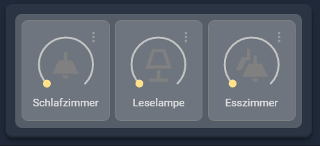
So hier mal ein Input zum Thema.  Die Card ist so verschachtelt wie im besprochenem Foto und kann nach belieben angepasst werden. Ich habe einfach entsprechende Beispiele für das Layout zusammengefasst. Icon-Color und Textfarbe habe ich jetzt nicht weiter beachtet, ging mir nur um das Layout.
Zur besseren Unterteilung habe ich Striche eingefügt. Die können natürlich dann herausgelöscht werden. So wird ein Strich definiert oder habe ich es gemacht:
  - type: custom:mod-card
    card_mod:
      style: |
        ha-card {
            height: 1px;
            border-bottom: 1px;
            background-color: grey !important;
            margin-left: 20px;
            margin-right: 20px;
        }

type: custom:stack-in-card
card_mod:
style: |
ha-card {
padding: 5px;
border: none !important;
border-radius: 10px !important;
background: rgba(255, 255, 255, 0.05);
box-shadow: rgba(0, 0, 0, 0.4) 0px 2px 4px, rgba(0, 0, 0, 0.3) 0px 7px
13px -3px, rgba(0, 0, 0, 0.2) 0px -3px 0px inset !important;
}
cards:
- type: tile
entity: switch.growzelt_innenlufter
icon: mdi:led-strip-variant
vertical: false
hide_state: true
name: Dekolicht
tap_action:
action: toggle
card_mod:
style: |
ha-card {
background: rgba(255, 255, 255, 0.2);
border: none;
border-radius: 10px !important;
margin: 10px;
float: right
}
.card-content {
margin: auto !important;
}
- type: custom:vertical-stack-in-card
card_mod:
style: |
ha-card {
background: rgba(255, 255, 255, 0.2) !important;
border: none;
border-radius: 10px !important;
margin: 10px;
padding: 10px;
}
cards:
- type: horizontal-stack
cards:
- type: light
entity: light.schlafzimmer_mutti_leuchte
icon: mdi:ceiling-light
name: Schlafzimmer
theme: grey-icon
hold_action:
action: more-info
double_tap_action:
action: more-info
card_mod:
style: |
ha-card {
background: rgba(255, 255, 255, 0.15);
border: 1px solid grey;
border-radius: 10px !important;
margin: 0px;
display: flex !important;
align-items: center !important;
justify-content: center !important;
text-align: center !important;
}
#info {
font-size: 110% !important;
}
.card-content {
margin: auto !important;
}
- type: light
entity: light.leselampe_mutti
name: "Leselampe "
theme: grey-icon
icon: mdi:lamp-outline
hold_action:
action: more-info
double_tap_action:
action: more-info
card_mod:
style: |
ha-card {
background: rgba(255, 255, 255, 0.15);
border: 1px solid grey;
border-radius: 10px !important;
margin: 0px;
display: flex !important;
align-items: center !important;
justify-content: center !important;
text-align: center !important;
}
#info {
font-size: 110% !important;
}
.card-content {
margin: auto !important;
}
- type: light
entity: light.esszimmerlicht_lampe_gruppe_mutti
name: Esszimmer
theme: grey-icon
icon: mdi:ceiling-light-multiple
hold_action:
action: more-info
double_tap_action:
action: more-info
card_mod:
style: |
ha-card {
background: rgba(255, 255, 255, 0.15);
border: 1px solid grey;
border-radius: 10px !important;
margin: 0px;
display: flex !important;
align-items: center !important;
justify-content: center !important;
text-align: center !important;
}
#info {
font-size: 110% !important;
}
.card-content {
margin: auto !important;
}
- type: custom:mod-card
card_mod:
style: |
ha-card {
height: 1px;
border-bottom: 1px;
background-color: grey !important;
margin-left: 20px;
margin-right: 20px;
}
- type: custom:vertical-stack-in-card
card_mod:
style: |
ha-card {
border: none;
border-radius: 10px !important;
margin: 10px;
padding: 10px;
}
cards:
- type: horizontal-stack
cards:
- type: tile
entity: switch.growzelt_innenlufter
icon: mdi:led-strip-variant
vertical: false
hide_state: true
name: Dekolicht
tap_action:
action: toggle
card_mod:
style: |
ha-card {
background: rgba(255, 255, 255, 0.2);
border: 1px solid grey;
border-radius: 10px !important;
margin: 0px;
display: flex !important;
align-items: center !important;
justify-content: center !important;
text-align: center !important;
}
.card-content {
margin: auto !important;
}
- type: tile
entity: switch.herdlicht_gruppe_mutti
name: Herdlicht
tap_action:
action: toggle
vertical: false
icon: mdi:led-strip
show_entity_picture: false
hide_state: true
card_mod:
style: |
ha-card {
background: rgba(255, 255, 255, 0.2);
border: 1px solid grey;
border-radius: 10px !important;
margin: 0px;
display: flex !important;
align-items: center !important;
justify-content: center !important;
text-align: center !important;
}
.card-content {
margin: auto !important;
}
- type: tile
entity: switch.korridorlicht
name: Flurlicht
tap_action:
action: toggle
vertical: false
icon: mdi:ceiling-light
show_entity_picture: false
hide_state: true
card_mod:
style: |
ha-card {
background: rgba(255, 255, 255, 0.2);
border: 1px solid grey;
border-radius: 10px !important;
margin: 0px;
display: flex !important;
align-items: center !important;
justify-content: center !important;
text-align: center !important;
}
.card-content {
margin: auto !important;
}
- type: custom:mod-card
card_mod:
style: |
ha-card {
height: 1px;
border-bottom: 1px;
background-color: grey !important;
margin-left: 20px;
margin-right: 20px;
}
- type: horizontal-stack
cards:
- type: custom:vertical-stack-in-card
card_mod:
style: |
ha-card {
border: none;
margin: 20px;
}
cards:
- type: horizontal-stack
cards:
- type: tile
entity: light.stehlampe
icon: mdi:floor-lamp
vertical: false
hide_state: true
name: Lampe
tap_action:
action: toggle
card_mod:
style: |
ha-card {
background: rgba(255, 255, 255, 0.2);
border: 1px solid grey;
border-radius: 10px !important;
padding: 10px 10px 10px 5px;
overflow: hidden !important;
display: flex !important;
align-items: center !important;
justify-content: center !important;
text-align: center !important;
}
.card-content {
margin: auto !important;
}
- type: tile
entity: light.wohnzimmer_treppe_mutti_leuchte
name: Treppe
tap_action:
action: toggle
double_tap_action:
action: more-info
vertical: false
icon: mdi:lightbulb
show_entity_picture: false
hide_state: true
card_mod:
style: |
ha-card {
background: rgba(255, 255, 255, 0.2);
border: 1px solid grey;
border-radius: 10px !important;
padding: 10px 10px 10px 5px;
overflow: hidden !important;
display: flex !important;
align-items: center !important;
justify-content: center !important;
text-align: center !important;
}
.card-content {
margin: auto !important;
}
- type: custom:vertical-stack-in-card
card_mod:
style: |
ha-card {
border: none;
margin: 10px;
}
cards:
- type: custom:mushroom-fan-card
entity: fan.starkvind_luftreiniger_mutti_ventilator
show_percentage_control: false
show_oscillate_control: false
collapsible_controls: false
icon_animation: true
fill_container: false
secondary_info: none
name: Luftreiniger
card_mod:
style: |
ha-card {
background: rgba(255, 255, 255, 0.2);
border: 1px solid grey;
border-radius: 10px !important;
margin: 10px;
display: flex !important;
align-items: center !important;
justify-content: center !important;
text-align: center !important;
}
- type: custom:mushroom-entity-card
entity: sensor.starkvind_luftreiniger_mutti_pm2_5
primary_info: none
fill_container: false
card_mod:
style: |
ha-card {
background: rgba(255, 255, 255, 0.2);
border: 1px solid grey;
border-radius: 10px !important;
margin: 10px;
display: flex !important;
align-items: center !important;
justify-content: center !important;
text-align: center !important;
}
- type: custom:mod-card
card_mod:
style: |
ha-card {
height: 1px;
border-bottom: 1px;
background-color: grey !important;
margin-left: 20px;
margin-right: 20px;
}
- type: horizontal-stack
cards:
- type: custom:vertical-stack-in-card
card_mod:
style: |
ha-card {
background: rgba(255, 255, 255, 0.2) !important;
border: none;
border-radius: 10px !important;
margin: 10px;
}
cards:
- type: tile
entity: light.stehlampe
icon: mdi:floor-lamp
vertical: false
hide_state: true
name: " "
tap_action:
action: toggle
card_mod:
style: |
ha-card {
background: rgba(255, 255, 255, 0.2);
border: 1px solid grey;
border-radius: 10px !important;
margin: 10px;
height: 50px !important;
display: flex !important;
align-items: center !important;
justify-content: center !important;
text-align: center !important;
}
.card-content {
margin: auto !important;
}
- type: tile
entity: light.wohnzimmer_treppe_mutti_leuchte
name: " "
tap_action:
action: toggle
double_tap_action:
action: more-info
vertical: false
icon: mdi:lightbulb
show_entity_picture: false
hide_state: true
card_mod:
style: |
ha-card {
background: rgba(255, 255, 255, 0.2);
border: 1px solid grey;
border-radius: 10px !important;
margin: 10px;
height: 250px !important;
display: flex !important;
align-items: center !important;
justify-content: center !important;
text-align: center !important;
}
.card-content {
margin: auto !important;
}
- type: custom:vertical-stack-in-card
card_mod:
style: |
ha-card {
background: rgba(255, 255, 255, 0.2) !important;
border: none;
border-radius: 10px !important;
margin: 10px;
}
cards:
- type: custom:mushroom-fan-card
entity: fan.starkvind_luftreiniger_mutti_ventilator
show_percentage_control: false
show_oscillate_control: false
collapsible_controls: false
icon_animation: true
fill_container: false
secondary_info: none
name: Luftreiniger
card_mod:
style: |
ha-card {
background: rgba(255, 255, 255, 0.2);
border: 1px solid grey;
border-radius: 10px !important;
margin: 10px;
height: 180px !important;
--card-primary-color: black !important;
display: flex !important;
align-items: center !important;
justify-content: center !important;
text-align: center !important;
}
- type: custom:mushroom-entity-card
entity: sensor.starkvind_luftreiniger_mutti_pm2_5
primary_info: none
fill_container: false
card_mod:
style: |
ha-card {
background: rgba(255, 255, 255, 0.2);
border: 1px solid grey;
border-radius: 10px !important;
margin: 10px;
height: 120px !important;
display: flex !important;
align-items: center !important;
justify-content: center !important;
text-align: center !important;
}
Hier nur der erste Teil vom Code, darin ist eigentlich auch alles wichtige enthalten und sieht dann so aus:
type: custom:stack-in-card
card_mod:
  style: |
    ha-card {
      padding: 5px;
      border: none !important;
      border-radius: 10px !important;
      background: rgba(255, 255, 255, 0.05);
      box-shadow: rgba(0, 0, 0, 0.4) 0px 2px 4px, rgba(0, 0, 0, 0.3) 0px 7px
                  13px -3px, rgba(0, 0, 0, 0.2) 0px -3px 0px inset !important;
    }
cards:
  - type: custom:vertical-stack-in-card
    card_mod:
      style: |
        ha-card {
          background: rgba(255, 255, 255, 0.2) !important;
          border: none;
          border-radius: 10px !important;
          margin: 10px;
          padding: 10px;
        }
    cards:
      - type: horizontal-stack
        cards:
          - type: light
            entity: light.schlafzimmer_mutti_leuchte
            icon: mdi:ceiling-light
            name: Schlafzimmer
            theme: grey-icon
            hold_action:
              action: more-info
            double_tap_action:
              action: more-info
            card_mod:
              style: |
                ha-card {
                  background: rgba(255, 255, 255, 0.15);
                  border: 1px solid grey;
                  border-radius: 10px !important;
                  margin: 0px;
                  display: flex !important;
                  align-items: center !important;
                  justify-content: center !important;
                  text-align: center !important;
                }
                #info {
                  font-size: 110% !important;
                }
                .card-content {
                  margin: auto !important;
                }
          - type: light
            entity: light.leselampe_mutti
            name: "Leselampe "
            theme: grey-icon
            icon: mdi:lamp-outline
            hold_action:
              action: more-info
            double_tap_action:
              action: more-info
            card_mod:
              style: |
                ha-card {
                  background: rgba(255, 255, 255, 0.15);
                  border: 1px solid grey;
                  border-radius: 10px !important;
                  margin: 0px;
                  display: flex !important;
                  align-items: center !important;
                  justify-content: center !important;
                  text-align: center !important;
                }
                #info {
                  font-size: 110% !important;
                }
                .card-content {
                  margin: auto !important;
                }
          - type: light
            entity: light.esszimmerlicht_lampe_gruppe_mutti
            name: Esszimmer
            theme: grey-icon
            icon: mdi:ceiling-light-multiple
            hold_action:
              action: more-info
            double_tap_action:
              action: more-info
            card_mod:
              style: |
                ha-card {
                  background: rgba(255, 255, 255, 0.15);
                  border: 1px solid grey;
                  border-radius: 10px !important;
                  margin: 0px;
                  display: flex !important;
                  align-items: center !important;
                  justify-content: center !important;
                  text-align: center !important;
                }
                #info {
                  font-size: 110% !important;
                }
                .card-content {
                  margin: auto !important;
                }
4 „Gefällt mir“
yes, das sieht super aus. vielen dank 
erste anpassung vorgenommen

der transparenzeffekt ist klar sichtbar. ich bin total begeistert. nochmal vielen vielen dank an alle beteiligten. jetzt wird getestet und gebaut.
das resultat werde ich dann hier posten.
3 „Gefällt mir“
mein erster versuch, in den horizontalen stapel, einen vertikalen zu packen ist direkt missglückt….

dann habe ich mir gedacht, fängst du einfach von vorn an und habe einen vertikalen stapel gebaut, gefolgt von einem horizontalen. und siehe da, wesentlich besser.

puh ganz schön aufwendig und vor allem, nichts im visuellen editor. aber ich fuchse mich langsam ein und fange an, die materie zu verstehen  .
.
4 „Gefällt mir“