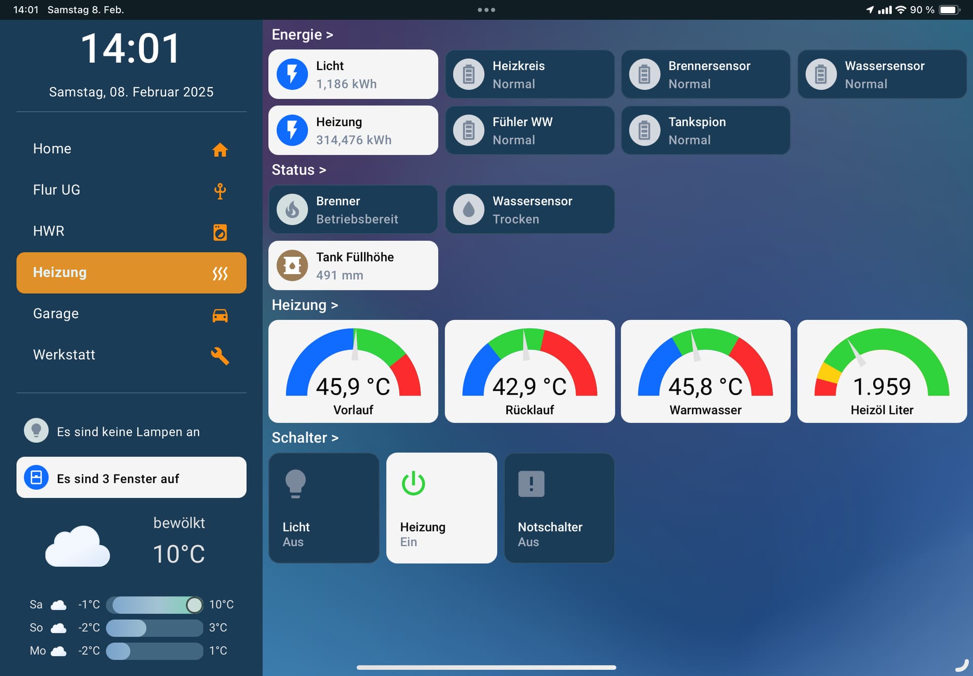
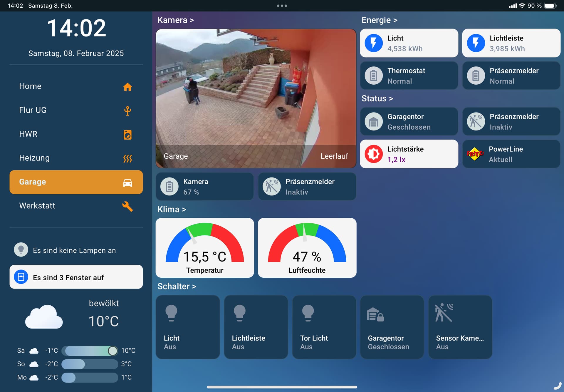
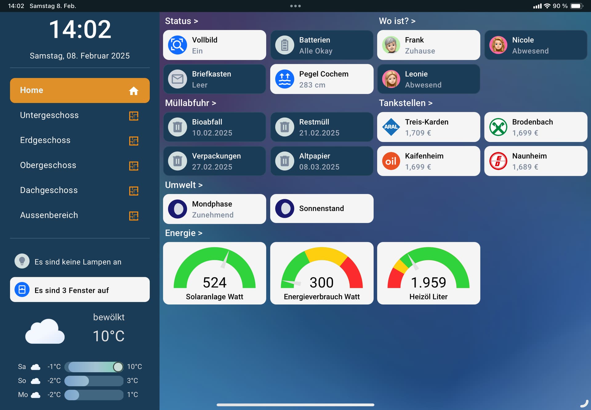
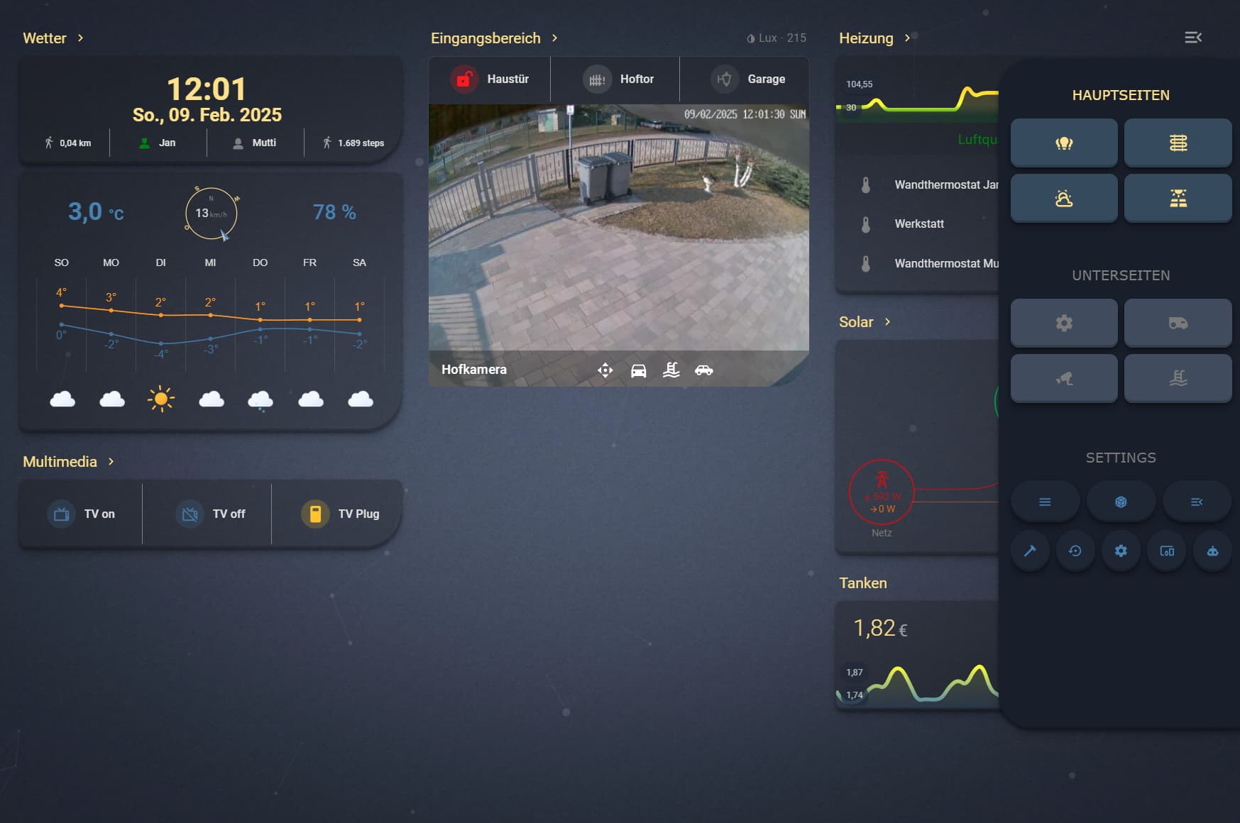
Hier mal mein Dashboard. Ist noch im Bastelstadium 
5 „Gefällt mir“
gefällt mir sehr gut, würdest du die yaml Codes zur Verfügung stellen?
1 „Gefällt mir“
Hi, ja gerne. Ist aber wohl etwas zu lang um das hier zu posten. Oder ist das kein Problem?
2 „Gefällt mir“
du kannst mir auch gerne eine PN schreiben
1 „Gefällt mir“
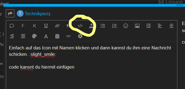
Sorry, und wie mach ich das? 
1 „Gefällt mir“
Wenn du das als vorformatierten Text einfügst, sollte das kein Problem sein 
1 „Gefällt mir“
Einfach auf das Icon mit Namen klicken und dann kannst du ihm eine Nachricht schicken.
code kansnt du hiermit einfügen
Schickes Design, wie hast du Seitenleiste gelöst? Ist die nur optisch eingefügt oder lässt die sich auf- und zuklappen?
1 „Gefällt mir“
kiosk_mode:
  entity_settings:
    - entity:
        input_boolean.vollbild: 'on'
      hide_header: true
      hide_sidebar: true
sidebar:
  hideTopMenu: false
  hideHassSidebar: false
  width:
    desktop: 27
  digitalClock: true
  digitalClockWithSeconds: false
  clock: false
  date: true
  dateFormat: dddd, DD. MMMM YYYY
  sidebarMenu:
    - action: navigate
      navigation_path: /dashboard-admin/admin_home
      name: Home
      active: true
      icon: mdi:home
    - action: navigate
      navigation_path: /admin-ug
      name: Untergeschoss
      active: true
      icon: mdi:floor-plan
    - action: navigate
      navigation_path: /admin-eg
      name: Erdgeschoss
      active: true
      icon: mdi:floor-plan
    - action: navigate
      navigation_path: /dashboard-admin/admin_obergeschoss
      name: Obergeschoss
      active: true
      icon: mdi:floor-plan
    - action: navigate
      navigation_path: /dashboard-admin/admin_dachgeschoss
      name: Dachgeschoss
      active: true
      icon: mdi:floor-plan
    - action: navigate
      navigation_path: /dashboard-admin/admin_aussenbereich
      name: Aussenbereich
      active: true
      icon: mdi:floor-plan
  bottomCard:
    type: custom:vertical-stack-in-card
    card_mod:
      style: |
        ha-card {
          border: none; /* Entfernt den Rahmen der Karte */
          background: transparent; /* Setzt den Hintergrund der Karte auf transparent */
        }
    cardOptions:
      cards:
        - type: custom:mushroom-entity-card
          entity: sensor.lights_on
          primary_info: ''
          name: ''
          secondary_info: state
          icon: mdi:lightbulb
          card_mod:
            style:
              mushroom-state-info$: |
                .container {
                  /* --card-primary-color: */
                  --card-secondary-color:
                    {% if is_state("sensor.counter_lights_on", "0") %}
                      white
                    {% else %}
                      black
                    {% endif %};
                  /* --card-primary-font-size: 15px; */
                  --card-secondary-font-size: 15px;
                  /* --card-primary-font-weight: 500; */
                  --card-secondary-font-weight:
                    {% if is_state("sensor.counter_lights_on", "0") %}
                      normal
                    {% else %}
                      500
                    {% endif %};
                  gap: 4px;
                }
              mushroom-shape-icon$: |
                .shape {
                  --shape-color:
                    {% if is_state("sensor.counter_lights_on", "0") %}
                      #D3DFDE
                    {% else %}
                      #FECF0F
                    {% endif %} !important;
                  --icon-symbol-size: 20px;
                  --icon-size: 30px;
                }
              .: |
                ha-card {
                  background-color:
                    {% if is_state("sensor.counter_lights_on", "0") %}
                      #1B3C56
                    {% else %}
                      #F5F5F5
                    {% endif %};
                    border-radius: 10px !important;
                    height: 50px !important;
                 }
                ha-state-icon {
                  color:
                    {% if is_state("sensor.counter_lights_on", "0") %}
                      #7A889B
                    {% else %}
                      white
                    {% endif %};
                }
        - type: custom:gap-card
          height: 7
        - type: custom:mushroom-entity-card
          entity: sensor.window_open
          primary_info: ''
          name: ''
          secondary_info: state
          icon: mdi:window-closed
          card_mod:
            style:
              mushroom-state-info$: |
                .container {
                  /* --card-primary-color: */
                  --card-secondary-color:
                    {% if is_state("sensor.counter_window_open", "0") %}
                      white
                    {% else %}
                      black
                    {% endif %};
                  /* --card-primary-font-size: 15px; */
                  --card-secondary-font-size: 15px;
                  /* --card-primary-font-weight: bold; */
                  --card-secondary-font-weight:
                    {% if is_state("sensor.counter_window_open", "0") %}
                      normal
                    {% else %}
                      500
                    {% endif %};
                  gap: 4px;
                }
              mushroom-shape-icon$: |
                .shape {
                  --shape-color:
                    {% if is_state("sensor.counter_window_open", "0") %}
                      #D3DFDE
                    {% else %}
                      #106BFF
                    {% endif %} !important;
                  --icon-symbol-size: 20px;
                  --icon-size: 30px;
                }
              .: |
                ha-card {
                  background-color:
                    {% if is_state("sensor.counter_window_open", "0") %}
                      #1B3C56
                    {% else %}
                      #F5F5F5
                    {% endif %};
                    border-radius: 10px !important;
                    height: 50px !important;
                 }
                ha-state-icon {
                  color:
                    {% if is_state("sensor.counter_window_open", "0") %}
                      #7A889B
                    {% else %}
                      white
                    {% endif %};
                }
        - type: custom:clock-weather-card
          entity: weather.muenstermaifeld
          temperature_sensor: sensor.wetterstation_temperatur
          humidity_sensor: sensor.wetterstation_luftfeuchtigkeit
          forecast_rows: 3
          hide_clock: true
          hide_date: true
          weather_icon_type: fill
          animated_icon: true
          card_mod:
            style: >
              ha-card {
                background: transparent; /* Setzt den Hintergrund der Wetterkarte auf transparent */
                margin-top: -15px !important;
              }  ha-card > div > clock-weather-card-today >
              clock-weather-card-today-right >
              clock-weather-card-today-right-wrap >
              clock-weather-card-today-right-wrap-center {
                font-size: 30px;
              }  ha-card > div > clock-weather-card-today >
              clock-weather-card-today-left {
                width: 140px;
              } ha-card > div > clock-weather-card-today >
              clock-weather-card-today-right >
              clock-weather-card-today-right-wrap >
              clock-weather-card-today-right-wrap-top {
                font-size: 18px !important;
              }
    cardStyle: |
      :host {
        width: 100%; /* Setzt die Breite des Hosts auf 100% */
      }
      ha-card {
        border: none; /* Entfernt den Rahmen der Karte */
        background: transparent; /* Setzt den Hintergrund der Karte auf transparent */
        /* margin-bottom: 30px; */
      }
  style: |
    :host {
        --sidebar-background: #1B3C56; /* Setzt die Hintergrundfarbe der Seitenleiste */
        --sidebar-text-color: #FFFFFF; /* Setzt die Textfarbe der Seitenleiste */
        --border-radius: 10px; /* Definiert den Radius der Rahmen-Ecken */
        /* --face-color: var(--primary-text-color); Farbe des Ziffernblatts */
        /* --face-border-color: var(--primary-text-color); Rahmenfarbe des Ziffernblatts */
        /* --clock-hands-color: var(--primary-background-color); Farbe der Uhrzeiger */
        /* --clock-seconds-hand-color: var(--primary-color); Farbe des Sekundenzeigers */
        /* --clock-middle-background: var(--primary-text-color); Hintergrundfarbe der Mitte der Uhr */
        /* --clock-middle-border: var(--primary-background-color); Rahmenfarbe der Mitte der Uhr */
        /* box-shadow: inset -19px -1px 5px -14px var(--divider-color); Schatteneffekt seitlich der Seitenleiste */
        /* border-radius: 15px 0px 0px 15px; Radius der Rahmen-Ecken der Seitenleiste */
    }
    #customSidebar {
        z-index: 9999 !important; /* Setzt den z-index der benutzerdefinierten Seitenleiste */
    }
    .sidebarMenu li {
        line-height: 30px!important; /* Zeilenhöhe der Listenelemente in der Seitenleiste */
        color: #FFFFFF !important; /* Textfarbe der Listenelemente in der Seitenleiste */
        font-size: 17px !important;
        font-weight: 400 !important;
        letter-spacing: 0.03vw !important;
    }
    .bottom {
        width: 100% !important; /* Setzt die Breite des unteren Bereichs */
    }
    .sidebarMenu li.active {
        background-color: #FD8D0E!important; /* Hintergrundfarbe des aktiven Listenelements in der Seitenleiste */
        border-radius: 10px !important; /* Setzt den Radius der Rahmen-Ecken des aktiven Listenelements */
        color: #FFFFFF !important; /* Textfarbe des aktiven Listenelements */
        font-weight: bold !important; /* Fettschrift für das aktive Listenelement */
    }
    .sidebarMenu li.active ha-icon {
        color: #FFFFFF !important; /* Textfarbe des Icons im aktiven Listenelement */
    }
    .sidebarMenu li ha-icon {
        color: #FD8D0E !important; /* Textfarbe des Icons im aktiven Listenelement */
    }
    .digitalClock {
        margin-bottom: 0px; /* Setzt den unteren Innenabstand der digitalen Uhr */
        margin-top: -15px !important; /* Setzt den oberen Innenabstand der digitalen Uhr */
        color: #FFFFFF !important; /* Textfarbe der digitalen Uhr */
        /* opacity: 0.6; Setzt die Transparenz der digitalen Uhr */
        font-size: 50px !important; /* Schriftgröße der digitalen Uhr */
        font-weight: 500 !important; /* Fettschrift für die digitale Uhr */
        /* font-family: Arial Rounded MT; Schriftart der digitalen Uhr */
        /* letter-spacing: -0.05vw !important; Buchstabenabstand der digitalen Uhr */
        text-align: center; /* Zentrierung des Textes der digitalen Uhr */
    }
    .date {
        margin-bottom: -10px !important; /* Setzt den unteren Innenabstand des Datums */
        padding-top: 10px; /* Setzt den oberen Innenabstand des Datums */
        color: #FFFFFF; /* Textfarbe des Datums */
        /* opacity: 0.6; Setzt die Transparenz des Datums */
        font-size: 16px; /* Schriftgröße des Datums */
        font-weight: 400; /* Schriftgewicht des Datums */
        text-align: center; /* Zentrierung des Textes des Datums */
        letter-spacing: 0.03vw; /* Buchstabenabstand des Datums */
    }
3 „Gefällt mir“
Das ist die Sidebar. Aber noch in Bearbeitung.
Jetzt darf ich keine Antworten mehr geben. 3 sind aufgebraucht  Folgend die linke Seite, rechts ist gleich aufgebaut.
1 „Gefällt mir“
title: Home
type: sections
path: admin_home
icon: mdi:home
cards: []
background:
opacity: 100
alignment: center
size: cover
repeat: no-repeat
attachment: fixed
image: /local/pictures/background_01.png
max_columns: 2
sections:
- type: grid
cards:
- type: heading
grid_options:
rows: auto
icon: ""
heading_style: title
heading: Status >
card_mod:
style: |
ha-card > div > div > p {
font-weight: 500;
color: white;
font-size: 18px;
}
ha-card {
height: 20px !important;
}
- square: false
type: grid
cards:
- type: custom:mushroom-template-card
entity: input_boolean.vollbild
primary: Vollbild
secondary: |-
{% if is_state("input_boolean.vollbild", "off") %}
Aus
{% else %}
Ein
{% endif %}
icon: mdi:magnify-expand
icon_color: |-
{% if is_state("input_boolean.vollbild", "off") %}
#7A889B
{% else %}
white
{% endif %}
badge_icon: ""
tap_action:
action: toggle
card_mod:
style:
mushroom-state-info$: |
.container {
--card-primary-color:
{% if is_state("input_boolean.vollbild", "off") %}
white
{% else %}
black
{% endif %};
--card-secondary-color:
{% if is_state("input_boolean.vollbild", "off") %}
#A6AFBD
{% else %}
#7A889B
{% endif %};
--card-primary-font-size: 15px;
--card-secondary-font-size: 15px;
--card-primary-font-weight: 500;
--card-secondary-font-weight: 500;
gap: 4px;
}
mushroom-shape-icon$: |
.shape {
--shape-color:
{% if is_state("input_boolean.vollbild", "off") %}
#D3D7DE
{% else %}
#106BFF
{% endif %} !important;
--icon-symbol-size: 28px;
--icon-size: 38px;
}
.: |
ha-card {
background-color:
{% if is_state("input_boolean.vollbild", "off") %}
#1B3C56
{% else %}
#F5F5F5
{% endif %};
}
- type: custom:mushroom-entity-card
entity: sensor.battery_empty
primary_info: name
name: Batterien
secondary_info: state
icon: mdi:battery-high
card_mod:
style:
mushroom-state-info$: |
.container {
--card-primary-color:
{% if is_state("sensor.counter_battery_empty", "0") %}
white
{% else %}
black
{% endif %};
--card-secondary-color:
{% if is_state("sensor.counter_battery_empty", "0") %}
#A6AFBD
{% else %}
#7A889B
{% endif %};
--card-primary-font-size: 15px;
--card-secondary-font-size: 15px;
--card-primary-font-weight: 500;
--card-secondary-font-weight: 500;
gap: 4px;
}
mushroom-shape-icon$: |
.shape {
--shape-color:
{% if is_state("sensor.counter_battery_empty", "0") %}
#D3DFDE
{% else %}
#FC2B2D
{% endif %} !important;
--icon-symbol-size: 28px;
--icon-size: 38px;
}
.: |
ha-card {
background-color:
{% if is_state("sensor.counter_battery_empty", "0") %}
#1B3C56
{% else %}
#F5F5F5
{% endif %};
}
ha-state-icon {
color:
{% if is_state("sensor.counter_battery_empty", "0") %}
#7A889B
{% else %}
white
{% endif %};
}
columns: 2
- square: false
type: grid
cards:
- type: custom:mushroom-template-card
entity: input_boolean.briefkasten
primary: Briefkasten
secondary: |-
{% if is_state("input_boolean.briefkasten", "off") %}
Leer
{% else %}
Post
{% endif %}
icon: mdi:email-outline
icon_color: |-
{% if is_state("input_boolean.briefkasten", "off") %}
#7A889B
{% else %}
white
{% endif %}
badge_icon: ""
tap_action:
action: none
hold_action:
action: more-info
card_mod:
style:
mushroom-state-info$: |
.container {
--card-primary-color:
{% if is_state("input_boolean.briefkasten", "off") %}
white
{% else %}
black
{% endif %};
--card-secondary-color:
{% if is_state("input_boolean.briefkasten", "off") %}
#A6AFBD
{% else %}
#7A889B
{% endif %};
--card-primary-font-size: 15px;
--card-secondary-font-size: 15px;
--card-primary-font-weight: 500;
--card-secondary-font-weight: 500;
gap: 4px;
}
mushroom-shape-icon$: |
.shape {
--shape-color:
{% if is_state("input_boolean.briefkasten", "off") %}
#D3D7DE
{% else %}
#FECF0F
{% endif %} !important;
--icon-symbol-size: 28px;
--icon-size: 38px;
}
.: |
ha-card {
background-color:
{% if is_state("input_boolean.briefkasten", "off") %}
#1B3C56
{% else %}
#F5F5F5
{% endif %};
}
- type: custom:mushroom-entity-card
entity: sensor.cochem_mosel_wasserstand
name: Pegel Cochem
tap_action:
action: more-info
card_mod:
style:
mushroom-state-info$: |
.container {
--card-primary-color: black;
--card-secondary-color: #7A889B;
--card-secondary-font-size: 15px;
--card-primary-font-size: 15px;
--card-primary-font-weight: 500;
--card-secondary-font-weight: 500;
gap: 4px;
}
mushroom-shape-icon$: |
.shape {
--shape-color:
{% if states("sensor.cochem_mosel_wasserstand") | float() >= 600 %}
#FD8D0E
{% elif states("sensor.cochem_mosel_wasserstand") | float() >= 630 %}
#FC2B2D
{% else %}
#106BFF
{% endif %} !important;
--icon-symbol-size: 28px;
--icon-color: white;
--icon-size: 38px;
}
.: |
ha-card {
background-color: #F5F5F5;
/* border-radius: */
}
columns: 2
- type: heading
grid_options:
rows: auto
icon: ""
heading_style: title
heading: Müllabfuhr >
card_mod:
style: |
ha-card > div > div > p {
font-weight: 500;
color: white;
font-size: 18px;
}
ha-card {
height: 20px !important;
}
- square: false
type: grid
cards:
- type: custom:mushroom-entity-card
entity: sensor.bioabfall
primary_info: name
secondary_info: state
icon: mdi:trash-can
name: Bioabfall
card_mod:
style:
mushroom-state-info$: |
.container {
--card-primary-color:
{% if is_state("sensor.bioabfall", "Heute") or is_state("sensor.bioabfall", "Morgen") %}
black
{% else %}
white
{% endif %};
--card-secondary-color:
{% if is_state("sensor.bioabfall", "Heute") or is_state("sensor.bioabfall", "Morgen") %}
#7A889B
{% else %}
#A6AFBD
{% endif %};
--card-primary-font-size: 15px;
--card-secondary-font-size: 15px;
--card-primary-font-weight: 500;
--card-secondary-font-weight: 500;
gap: 4px;
}
mushroom-shape-icon$: |
.shape {
--shape-color:
{% if is_state("sensor.bioabfall", "Heute") or is_state("sensor.bioabfall", "Morgen") %}
#9B7C55
{% else %}
#D3DFDE
{% endif %} !important;
--icon-symbol-size: 28px;
--icon-size: 38px;
}
.: |
ha-card {
background-color:
{% if is_state("sensor.bioabfall", "Heute") or is_state("sensor.bioabfall", "Morgen") %}
#F5F5F5
{% else %}
#1B3C56
{% endif %};
}
ha-state-icon {
color:
{% if is_state("sensor.bioabfall", "Heute") or is_state("sensor.bioabfall", "Morgen") %}
white
{% else %}
#7A889B
{% endif %};
}
- type: custom:mushroom-entity-card
entity: sensor.restmull
primary_info: name
secondary_info: state
icon: mdi:trash-can
name: Restmüll
card_mod:
style:
mushroom-state-info$: |
.container {
--card-primary-color:
{% if is_state("sensor.restmull", "Heute") or is_state("sensor.restmull", "Morgen") %}
black
{% else %}
white
{% endif %};
--card-secondary-color:
{% if is_state("sensor.restmull", "Heute") or is_state("sensor.restmull", "Morgen") %}
#7A889B
{% else %}
#A6AFBD
{% endif %};
--card-primary-font-size: 15px;
--card-secondary-font-size: 15px;
--card-primary-font-weight: 500;
--card-secondary-font-weight: 500;
gap: 4px;
}
mushroom-shape-icon$: |
.shape {
--shape-color:
{% if is_state("sensor.restmull", "Heute") or is_state("sensor.restmull", "Morgen") %}
#5E5E5E
{% else %}
#D3DFDE
{% endif %} !important;
--icon-symbol-size: 28px;
--icon-size: 38px;
}
.: |
ha-card {
background-color:
{% if is_state("sensor.restmull", "Heute") or is_state("sensor.restmull", "Morgen") %}
#F5F5F5
{% else %}
#1B3C56
{% endif %};
}
ha-state-icon {
color:
{% if is_state("sensor.restmull", "Heute") or is_state("sensor.restmull", "Morgen") %}
white
{% else %}
#7A889B
{% endif %};
}
columns: 2
- square: false
type: grid
cards:
- type: custom:mushroom-entity-card
entity: sensor.verpackungen
primary_info: name
secondary_info: state
icon: mdi:trash-can
name: Verpackungen
card_mod:
style:
mushroom-state-info$: |
.container {
--card-primary-color:
{% if is_state("sensor.verpackungen", "Heute") or is_state("sensor.verpackungen", "Morgen") %}
black
{% else %}
white
{% endif %};
--card-secondary-color:
{% if is_state("sensor.verpackungen", "Heute") or is_state("sensor.verpackungen", "Morgen") %}
#7A889B
{% else %}
#A6AFBD
{% endif %};
--card-primary-font-size: 15px;
--card-secondary-font-size: 15px;
--card-primary-font-weight: 500;
--card-secondary-font-weight: 500;
gap: 4px;
}
mushroom-shape-icon$: |
.shape {
--shape-color:
{% if is_state("sensor.verpackungen", "Heute") or is_state("sensor.verpackungen", "Morgen") %}
#FECF0F
{% else %}
#D3DFDE
{% endif %} !important;
--icon-symbol-size: 28px;
--icon-size: 38px;
}
.: |
ha-card {
background-color:
{% if is_state("sensor.verpackungen", "Heute") or is_state("sensor.verpackungen", "Morgen") %}
#F5F5F5
{% else %}
#1B3C56
{% endif %};
}
ha-state-icon {
color:
{% if is_state("sensor.verpackungen", "Heute") or is_state("sensor.verpackungen", "Morgen") %}
white
{% else %}
#7A889B
{% endif %};
}
- type: custom:mushroom-entity-card
entity: sensor.papier
primary_info: name
secondary_info: state
icon: mdi:trash-can
name: Altpapier
card_mod:
style:
mushroom-state-info$: |
.container {
--card-primary-color:
{% if is_state("sensor.papier", "Heute") or is_state("sensor.papier", "Morgen") %}
black
{% else %}
white
{% endif %};
--card-secondary-color:
{% if is_state("sensor.papier", "Heute") or is_state("sensor.papier", "Morgen") %}
#7A889B
{% else %}
#A6AFBD
{% endif %};
--card-primary-font-size: 15px;
--card-secondary-font-size: 15px;
--card-primary-font-weight: 500;
--card-secondary-font-weight: 500;
gap: 4px;
}
mushroom-shape-icon$: |
.shape {
--shape-color:
{% if is_state("sensor.papier", "Heute") or is_state("sensor.papier", "Morgen") %}
#106BFF
{% else %}
#D3DFDE
{% endif %} !important;
--icon-symbol-size: 28px;
--icon-size: 38px;
}
.: |
ha-card {
background-color:
{% if is_state("sensor.papier", "Heute") or is_state("sensor.papier", "Morgen") %}
#F5F5F5
{% else %}
#1B3C56
{% endif %};
}
ha-state-icon {
color:
{% if is_state("sensor.papier", "Heute") or is_state("sensor.papier", "Morgen") %}
white
{% else %}
#7A889B
{% endif %};
}
columns: 2
- type: heading
grid_options:
rows: auto
icon: ""
heading_style: title
heading: Umwelt >
card_mod:
style: |
ha-card > div > div > p {
font-weight: 500;
color: white;
font-size: 18px;
}
ha-card {
height: 20px !important;
}
- square: false
type: grid
cards:
- type: custom:mushroom-template-card
primary: Mondphase
secondary: >-
{% if is_state("sensor.moon_phase", "waxing_crescent") or
is_state("sensor.moon_phase", "waxing_gibbous") %}
Zunehmend
{% elif is_state("sensor.moon_phase", "first_quarter") or
is_state("sensor.moon_phase", "last_quarter") %}
Halbmond
{% elif is_state("sensor.moon_phase", "full_moon") %}
Vollmond
{% elif is_state("sensor.moon_phase", "new_moon") %}
Neumond
{% else %}
Abnehmend
{% endif %}
icon: |-
{% if is_state("sensor.moon_phase", "waxing_crescent") %}
mdi:moon-waxing-crescent
{% elif is_state("sensor.moon_phase", "first_quarter") %}
mdi:moon-first-quarter
{% elif is_state("sensor.moon_phase", "waxing_gibbous") %}
mdi:moon-waxing-gibbous
{% elif is_state("sensor.moon_phase", "full_moon") %}
mdi:moon-full
{% elif is_state("sensor.moon_phase", "waning_gibbous") %}
mdi:moon-waning-gibbous
{% elif is_state("sensor.moon_phase", "last-quarter") %}
mdi:moon-lst-quarter
{% elif is_state("sensor.moon_phase", "waning_crescent") %}
mdi:moon-waning-crescent
{% else %}
mdi:moon-new
{% endif %}
card_mod:
style:
mushroom-state-info$: |
.container {
--card-primary-color: black;
--card-secondary-color: #7A889B;
--card-primary-font-size: 15px;
--card-secondary-font-size: 15px;
--card-primary-font-weight: 500;
--card-secondary-font-weight: 500;
gap: 4px;
}
mushroom-shape-icon$: |
.shape {
--shape-color: #191970 !important;
--icon-symbol-size: 28px;
--icon-size: 38px;
}
.: |
ha-card {
background-color: #F5F5F5;
}
ha-state-icon {
color: #D8DCE4;
}
- type: custom:mushroom-entity-card
entity: sensor.sun_set_rise
name: Sonnenstand
tap_action:
action: more-info
card_mod:
style:
mushroom-state-info$: |
.container {
--card-primary-color: black;
--card-secondary-color: #7A889B;
--card-secondary-font-size: 15px;
--card-primary-font-size: 15px;
--card-primary-font-weight: 500;
--card-secondary-font-weight: 500;
gap: 4px;
}
mushroom-shape-icon$: |
.shape {
--shape-color: #FD8D0E;
--icon-symbol-size: 28px;
--icon-color: white;
--icon-size: 38px;
}
.: |
ha-card {
background-color: #F5F5F5;
/* border-radius: */
}
ha-state-icon {
--card-mod-icon:
{% if is_state("sun.sun", "above_horizon") %}
mdi:weather-sunset-down
{% else %}
mdi:weather-sunset-up
{% endif %} !important;
}
columns: 2
- type: heading
grid_options:
rows: auto
icon: ""
heading_style: title
heading: Energie >
card_mod:
style: |
ha-card > div > div > p {
font-weight: 500;
color: white;
font-size: 18px;
}
ha-card {
height: 20px !important;
}
- square: false
type: grid
cards:
- type: gauge
name: Solaranlage Watt
min: 0
max: 850
segments:
- from: 0
color: "#30D33B"
needle: true
entity: sensor.round_leistung_solar
card_mod:
style:
ha-gauge:
$:
svg.text: |
text.value-text {
fill:
{% if is_state("sensor.round_leistung_solar", "0") %}
white
{% else %}
black
{% endif %};
/* font-size: 20px; */
}
.: |
ha-card {
background-color:
{% if is_state("sensor.round_leistung_solar", "0") %}
#1B3C56
{% else %}
#F5F5F5
{% endif %};
/* padding: 1px; */
/* box-shadow: 0px 2px 4px 0px rgba(0,0,0,0.66); */
height: 125px !important;
}
ha-card > div {
color:
{% if is_state("sensor.round_leistung_solar", "0") %}
#A6AFBD
{% else %}
black
{% endif %} !important;
font-weight: 500;
font-size: 15px !important;
}
- type: gauge
entity: sensor.power_consumption
name: Energieverbrauch Watt
min: 0
max: 5000
segments:
- from: 0
color: "#30D33B"
- from: 1800
color: "#FECF0F"
- from: 3600
color: "#FC2B2D"
needle: true
card_mod:
style:
ha-gauge:
$:
svg.text: |
text.value-text {
fill: black;
/* font-size: 20px; */
}
.: |
ha-card {
background-color: #F5F5F5;
/* padding: 1px; */
/* box-shadow: 0px 2px 4px 0px rgba(0,0,0,0.66); */
height: 125px !important;
}
ha-card > div {
color: black !important;
font-weight: 500;
font-size: 15px !important;
}
columns: 2
1 „Gefällt mir“
@Technikperry warum packst du das nicht alles in einen Post? Doppelpost verhindert man dadurch
2 „Gefällt mir“
Bin noch neu hier 
2 „Gefällt mir“
Ich wollte dich mit diesem Beitrag nur kurz darauf hinweisen, dass sich bei „Abwesend“ ein „n“ eingeschlichen hat.
Falls es so gehört, dann…
1 „Gefällt mir“
Habe gerade gesehen, danke dir ich hätte nie drauf geachtet 
1 „Gefällt mir“
schönes projekt. sieht schon besser aus, als meine ersten gehversuche .
die sidebar hat bei mit immer rumgezickt. habe mich letztendlich dagegen entschieden.
1 „Gefällt mir“
So eine Sidebar ist schon nicht schlecht, habe ich bei mir auf der Startseite mit einer conditional Card und card-mod realsiert. Daher hatte mich auch die Umsetzung von @Technikperry interessiert. Bei mir legt sie sich aber über den Content und schiebt ihn nicht zur Seite. So kann ich alle Seiten und Einstellungen erreichen. Auf den Unterseiten wird dann das Menü am unteren Rand eingeblendet.
type: conditional
conditions:
- condition: state
entity: input_boolean.button_sidebar_menu
state: "on"
card:
type: custom:layout-card
layout_type: custom:grid-layout
layout:
grid-template-columns: repeat(1, 1fr)
grid-template-rows: repeat(3, auto)
cards:
- type: custom:vertical-stack-in-card
card_mod:
style: |
ha-card {
background: #181e2a !important;
box-shadow: rgba(0, 0, 0, 0.4) 0px 2px 4px, rgba(0, 0, 0, 0.3) 0px 7px
13px -3px, rgba(0, 0, 0, 0.2) 0px -3px 0px inset !important;
border: none !important;
border-radius: 40px 0 0 40px !important;
width: 300px !important;
height:80%;
padding: 15px;
margin-top: 75px;
opacity: 1;
z-index: 2;
position: fixed;
top:0;
right:0;
}
cards:
- type: vertical-stack
cards:
- type: custom:button-card
color: transparent
icon: none
name: Hauptseiten
styles:
card:
- text-transform: uppercase;
- justify-content: middle
- align-self: middle
- margin: none
- height: 50px
- font-family: verdana
- color: var(--primary-color)
- background-color: transparent
- border-radius: 12px 12px 40px 12px
- border-style: none
- box-shadow: none
- type: horizontal-stack
cards:
- type: custom:button-card
color: transparent
icon: mdi:lightbulb-group
tap_action:
action: navigate
navigation_path: /dashboard-test/licht
styles:
card:
- background-color: "#354b5e"
- border-radius: 10px 10px 10px 10px
- border-style: none
- box-shadow: >-
rgba(0, 0, 0, 0.4) 0px 2px 4px, rgba(0, 0, 0, 0.3) 0px
7px 13px -3px, rgba(0, 0, 0, 0.2) 0px -3px 0px inset
icon:
- width: 25px
- height: 25px
- color: white
- align-self: start
- text-align: start
- padding: 12px
- color: var(--primary-color)
img_cell:
- justify-content: middle
- align-self: middle
- margin: none
- type: custom:button-card
color: transparent
icon: mdi:heating-coil
tap_action:
action: navigate
navigation_path: /dashboard-test/heizung
styles:
card:
- background-color: "#354b5e"
- border-radius: 10px 10px 10px 10px
- border-style: none
- box-shadow: >-
rgba(0, 0, 0, 0.4) 0px 2px 4px, rgba(0, 0, 0, 0.3) 0px
7px 13px -3px, rgba(0, 0, 0, 0.2) 0px -3px 0px inset
icon:
- width: 25px
- height: 25px
- color: white
- align-self: start
- text-align: start
- padding: 12px
- color: var(--primary-color)
img_cell:
- justify-content: middle
- align-self: middle
- margin: none
- type: horizontal-stack
cards:
- type: custom:button-card
color: transparent
icon: mdi:weather-partly-cloudy
tap_action:
action: navigate
navigation_path: /dashboard-test/wetter
styles:
card:
- background-color: "#354b5e"
- border-radius: 10px 10px 10px 10px
- border-style: none
- box-shadow: >-
rgba(0, 0, 0, 0.4) 0px 2px 4px, rgba(0, 0, 0, 0.3) 0px
7px 13px -3px, rgba(0, 0, 0, 0.2) 0px -3px 0px inset
icon:
- width: 25px
- height: 25px
- color: white
- align-self: start
- text-align: start
- padding: 12px
- color: var(--primary-color)
img_cell:
- justify-content: middle
- align-self: middle
- margin: none
- type: custom:button-card
color: transparent
icon: mdi:solar-power-variant
tap_action:
action: navigate
navigation_path: /dashboard-test/solar
styles:
card:
- background-color: "#354b5e"
- border-radius: 10px 10px 10px 10px
- border-style: none
- box-shadow: >-
rgba(0, 0, 0, 0.4) 0px 2px 4px, rgba(0, 0, 0, 0.3) 0px
7px 13px -3px, rgba(0, 0, 0, 0.2) 0px -3px 0px inset
icon:
- width: 25px
- height: 25px
- color: white
- align-self: start
- text-align: start
- padding: 12px
- color: var(--primary-color)
img_cell:
- justify-content: middle
- align-self: middle
- margin: none
- type: vertical-stack
cards:
- type: custom:button-card
color: transparent
icon: none
name: Unterseiten
styles:
card:
- text-transform: uppercase;
- justify-content: middle
- align-self: middle
- margin: none
- height: 85px
- font-family: verdana
- color: grey
- background-color: transparent
- border-radius: 12px 12px 40px 12px
- border-style: none
- box-shadow: none
- type: horizontal-stack
cards:
- type: custom:button-card
color: transparent
icon: mdi:cog
tap_action:
action: navigate
navigation_path: /dashboard-test/einstellungen
styles:
card:
- background-color: "#404b5e"
- border-radius: 10px 10px 10px 10px
- border-style: none
- box-shadow: >-
rgba(0, 0, 0, 0.4) 0px 2px 4px, rgba(0, 0, 0, 0.3) 0px
7px 13px -3px, rgba(0, 0, 0, 0.2) 0px -3px 0px inset
icon:
- width: 25px
- height: 25px
- color: white
- align-self: start
- text-align: start
- padding: 12px
- color: var(--secondary-text-color)
img_cell:
- justify-content: middle
- align-self: middle
- margin: none
- type: custom:button-card
color: transparent
icon: mdi:robot-mower
tap_action:
action: navigate
navigation_path: /dashboard-test/robter-steuerung
styles:
card:
- background-color: "#404b5e"
- border-radius: 10px 10px 10px 10px
- border-style: none
- box-shadow: >-
rgba(0, 0, 0, 0.4) 0px 2px 4px, rgba(0, 0, 0, 0.3) 0px
7px 13px -3px, rgba(0, 0, 0, 0.2) 0px -3px 0px inset
icon:
- width: 25px
- height: 25px
- color: white
- align-self: start
- text-align: start
- padding: 12px
- color: var(--secondary-text-color)
img_cell:
- justify-content: middle
- align-self: middle
- margin: none
- type: horizontal-stack
cards:
- type: custom:button-card
color: transparent
icon: mdi:cctv
tap_action:
action: navigate
navigation_path: /dashboard-test/sicherheit
styles:
card:
- background-color: "#404b5e"
- border-radius: 10px 10px 10px 10px
- border-style: none
- box-shadow: >-
rgba(0, 0, 0, 0.4) 0px 2px 4px, rgba(0, 0, 0, 0.3) 0px
7px 13px -3px, rgba(0, 0, 0, 0.2) 0px -3px 0px inset
icon:
- width: 25px
- height: 25px
- color: white
- align-self: start
- text-align: start
- padding: 12px
- color: var(--secondary-text-color)
img_cell:
- justify-content: middle
- align-self: middle
- margin: none
- type: custom:button-card
color: transparent
icon: mdi:pool
tap_action:
action: navigate
navigation_path: /dashboard-test/garten
styles:
card:
- background-color: "#404b5e"
- border-radius: 10px 10px 10px 10px
- border-style: none
- box-shadow: >-
rgba(0, 0, 0, 0.4) 0px 2px 4px, rgba(0, 0, 0, 0.3) 0px
7px 13px -3px, rgba(0, 0, 0, 0.2) 0px -3px 0px inset
icon:
- width: 25px
- height: 25px
- color: white
- align-self: start
- text-align: start
- padding: 12px
- color: var(--secondary-text-color)
img_cell:
- justify-content: middle
- align-self: middle
- margin: none
- type: vertical-stack
cards:
- type: custom:button-card
color: transparent
name: Settings
icon: none
styles:
card:
- text-transform: uppercase;
- justify-content: middle
- align-self: middle
- margin: none
- height: 87px
- font-family: verdana
- color: var(--secondary-text-color)
- background-color: transparent
- border-radius: 12px 12px 40px 12px
- border-style: none
- box-shadow: none
- type: horizontal-stack
cards:
- type: custom:button-card
color: transparent
icon: mdi:menu
tap_action:
action: perform-action
perform_action: input_boolean.toggle
target:
entity_id: input_boolean.kioskmode
styles:
card:
- background-color: "#1f2634"
- border-radius: 40px
- border-style: none
- box-shadow: >-
rgba(0, 0, 0, 0.4) 0px 2px 4px, rgba(0, 0, 0, 0.3) 0px
7px 13px -3px, rgba(0, 0, 0, 0.2) 0px -3px 0px inset
icon:
- width: 18px
- height: 20px
- color: white
- align-self: start
- text-align: start
- padding: 12px
- color: steelblue
img_cell:
- justify-content: middle
- align-self: middle
- margin: none
- type: custom:button-card
color: transparent
icon: mdi:webpack
tap_action:
action: perform-action
perform_action: input_boolean.toggle
target:
entity_id: input_boolean.button_background_dashboard
styles:
card:
- background-color: "#1f2634"
- border-radius: 40px
- border-style: none
- box-shadow: >-
rgba(0, 0, 0, 0.4) 0px 2px 4px, rgba(0, 0, 0, 0.3) 0px
7px 13px -3px, rgba(0, 0, 0, 0.2) 0px -3px 0px inset
icon:
- width: 18px
- height: 20px
- color: white
- align-self: start
- text-align: start
- padding: 12px
- color: steelblue
img_cell:
- justify-content: middle
- align-self: middle
- margin: none
- type: custom:button-card
color: transparent
icon: mdi:menu-open
tap_action:
action: perform-action
perform_action: input_boolean.toggle
target:
entity_id: input_boolean.button_sidebar_menu
styles:
card:
- background-color: "#1f2634"
- border-radius: 40px
- border-style: none
- box-shadow: >-
rgba(0, 0, 0, 0.4) 0px 2px 4px, rgba(0, 0, 0, 0.3) 0px
7px 13px -3px, rgba(0, 0, 0, 0.2) 0px -3px 0px inset
icon:
- width: 18px
- height: 20px
- color: white
- align-self: start
- text-align: start
- padding: 12px
- color: steelblue
img_cell:
- justify-content: middle
- align-self: middle
- margin: none
- type: custom:vertical-stack-in-card
card_mod:
style: |
ha-card {
border: none;
background: none;
border: none;
border-radius: 0px !important;
margin-top: 10px !important;
padding-bottom: 6px;
}
cards:
- type: horizontal-stack
cards:
- type: custom:button-card
color: transparent
icon: mdi:hammer
tap_action:
action: navigate
navigation_path: /developer-tools/yaml
styles:
card:
- background-color: "#1f2634"
- border-radius: 40px
- border-style: none
- box-shadow: >-
rgba(0, 0, 0, 0.4) 0px 2px 4px, rgba(0, 0, 0, 0.3) 0px
7px 13px -3px, rgba(0, 0, 0, 0.2) 0px -3px 0px inset
icon:
- width: 18px
- height: 23px
- color: white
- align-self: start
- text-align: start
- padding: 12px
- color: steelblue
img_cell:
- justify-content: middle
- align-self: middle
- margin: none
- type: custom:button-card
color: transparent
icon: mdi:backup-restore
tap_action:
action: navigate
navigation_path: /config/backup/overview
styles:
card:
- background-color: "#1f2634"
- border-radius: 40px
- border-style: none
- box-shadow: >-
rgba(0, 0, 0, 0.4) 0px 2px 4px, rgba(0, 0, 0, 0.3) 0px
7px 13px -3px, rgba(0, 0, 0, 0.2) 0px -3px 0px inset
icon:
- width: 18px
- height: 23px
- color: white
- align-self: start
- text-align: start
- padding: 12px
- color: steelblue
img_cell:
- justify-content: middle
- align-self: middle
- margin: none
- type: custom:button-card
color: transparent
icon: mdi:cog
tap_action:
action: navigate
navigation_path: /config
styles:
card:
- background-color: "#1f2634"
- border-radius: 40px
- border-style: none
- box-shadow: >-
rgba(0, 0, 0, 0.4) 0px 2px 4px, rgba(0, 0, 0, 0.3) 0px
7px 13px -3px, rgba(0, 0, 0, 0.2) 0px -3px 0px inset
icon:
- width: 18px
- height: 23px
- color: white
- align-self: start
- text-align: start
- padding: 12px
- color: steelblue
img_cell:
- justify-content: middle
- align-self: middle
- margin: none
- type: custom:button-card
color: transparent
icon: mdi:devices
tap_action:
action: navigate
navigation_path: /config/integrations/dashboard
styles:
card:
- background-color: "#1f2634"
- border-radius: 40px
- border-style: none
- box-shadow: >-
rgba(0, 0, 0, 0.4) 0px 2px 4px, rgba(0, 0, 0, 0.3) 0px
7px 13px -3px, rgba(0, 0, 0, 0.2) 0px -3px 0px inset
icon:
- width: 18px
- height: 23px
- color: white
- align-self: start
- text-align: start
- padding: 12px
- color: steelblue
img_cell:
- justify-content: middle
- align-self: middle
- margin: none
- type: custom:button-card
color: transparent
icon: mdi:robot
tap_action:
action: navigate
navigation_path: /config/automation/dashboard
styles:
card:
- background-color: "#1f2634"
- border-radius: 40px
- border-style: none
- box-shadow: >-
rgba(0, 0, 0, 0.4) 0px 2px 4px, rgba(0, 0, 0, 0.3) 0px
7px 13px -3px, rgba(0, 0, 0, 0.2) 0px -3px 0px inset
icon:
- width: 15px
- height: 23px
- color: white
- align-self: start
- text-align: start
- padding: 12px
- color: steelblue
img_cell:
- justify-content: middle
- align-self: middle
- margin: none
7 „Gefällt mir“
Hallöchen zusammen,
Vielen Dank für die ganzen tollen Dashboards habe mir aus ganz vielen meine Sachen zusammengebaut.
Bisher bin ich stiller Mitleser
Die Karten basieren alle auf Mushroomcards, die Popupcards sind Bubblecards, so habe ich nur ein Dashboard und muss nicht wild durch die gegend klicken.
Wobei das Dashboard eh nur als „nice to have“ dient, da fast alles automatisiert ist.
hier mal ein paar Bilder:
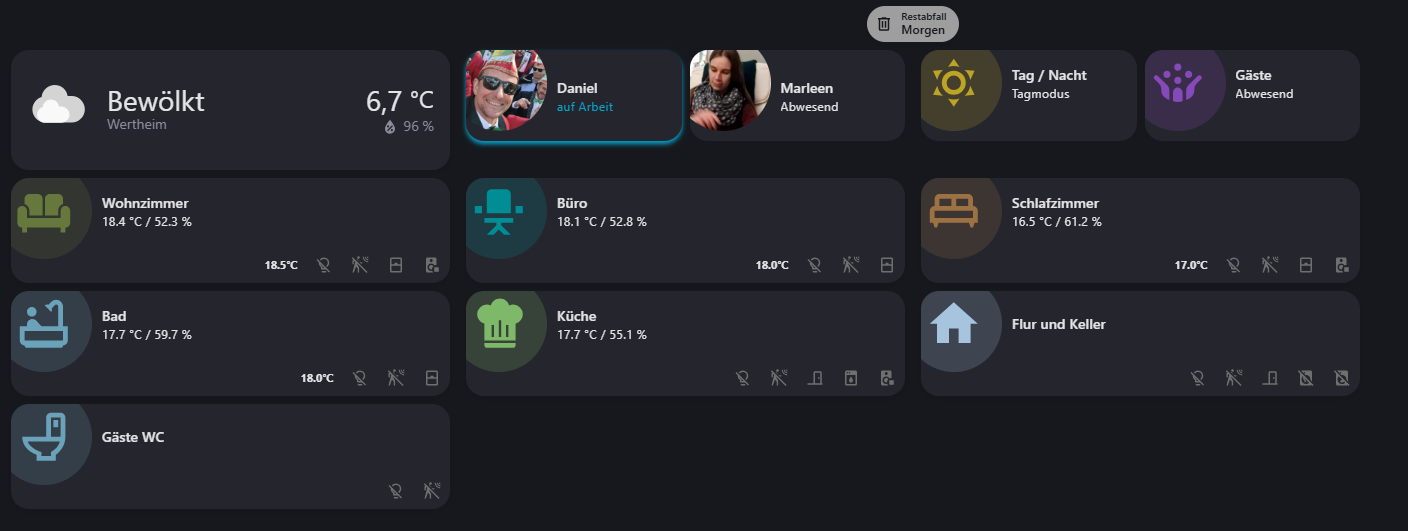
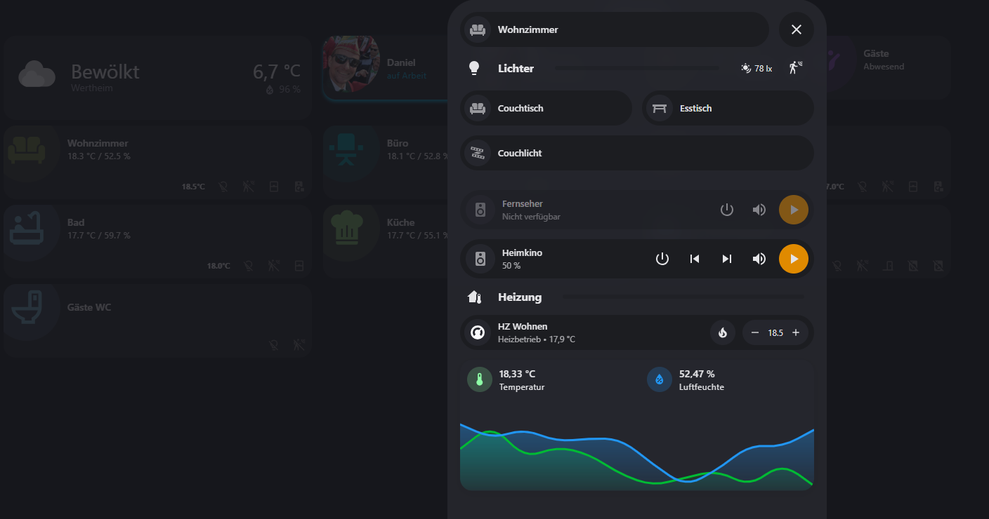
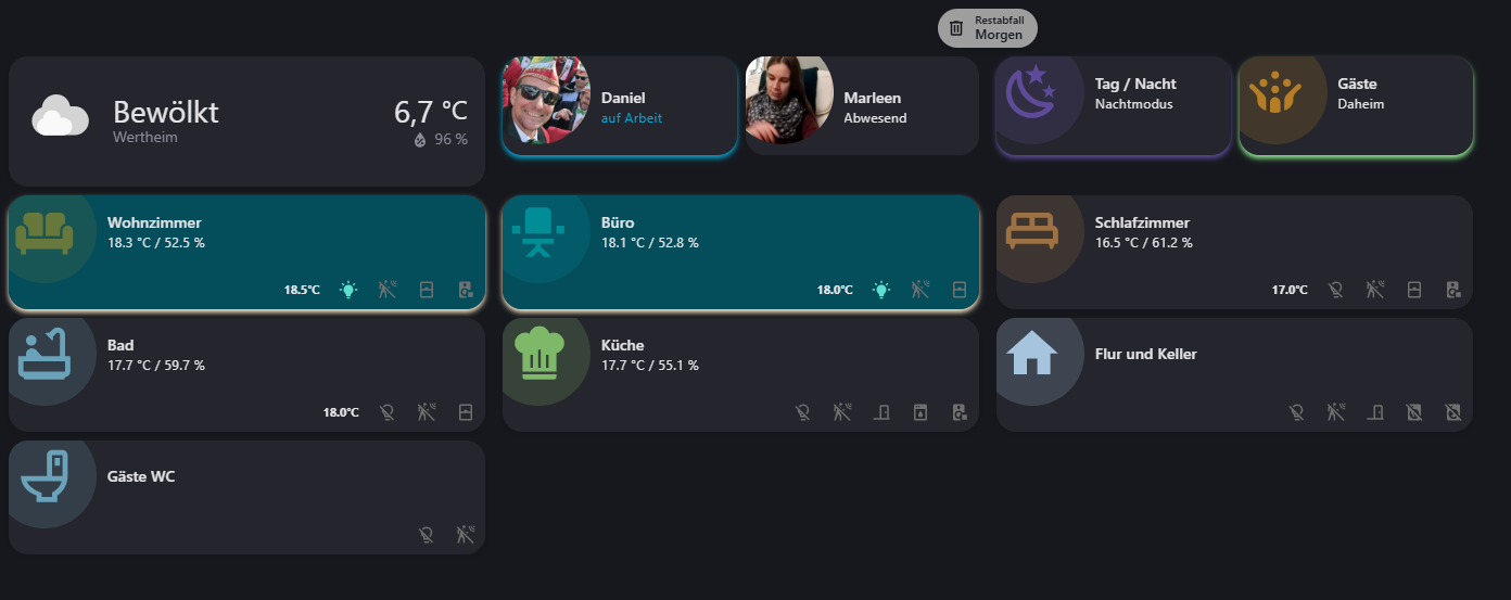
die Chipcards der einzelnen Karten ändern sowohl Symbol, wie auch Farbe, anhand des Status der Entität oder des Attributs.
Es fällt einem aber immer was neues ein was man noch machen kann.
habt alle noch einen tollen Abend!
Liebe Grüße Daniel
8 „Gefällt mir“
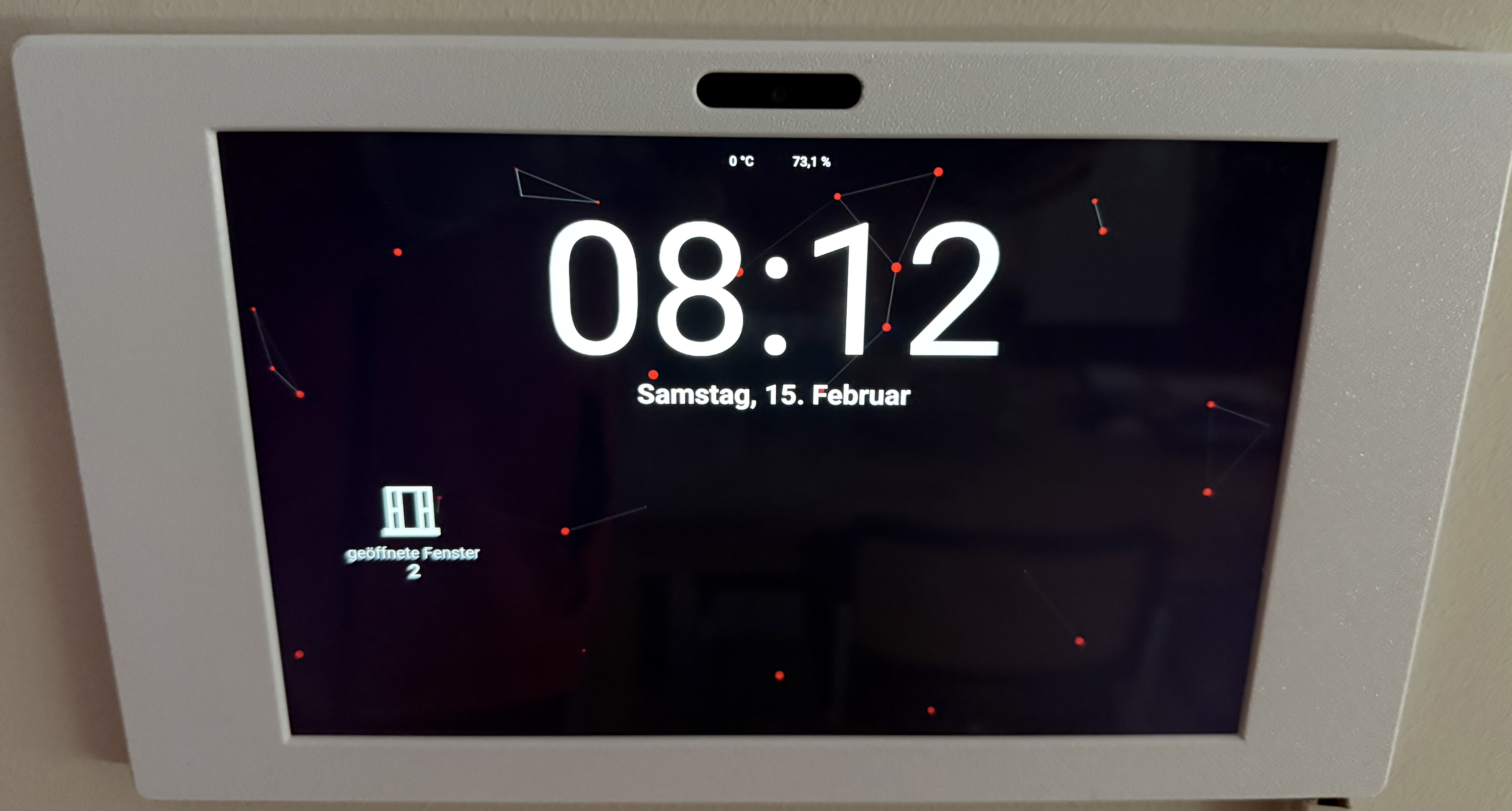
Ein Dashboard was als Sreensaver benutzt wird.
Eigentlich nur Uhrzeit,Datum, Außentemperatur und Luftfeuchtigkeit. Fenster offen und Post ist da wenn es zutrifft. Dank @jayjojayson auch mit schönen Hintergrund 
6 „Gefällt mir“